CRM mobile application - choosing the right nav.
The problem:
When designing complex systems such as CRM for mobile, it is critical to select navigation that fits the experience and does not get in the way. Aidium offers a robust CRM, and the challenge was to choose a nav pattern that will ease the use.
Year
2024
Client
Aidium
My Role and Collaborators
-

Mali (Me!)
DESIGNER
-

Rob
PRODUCT MANAGER
-

Karl
REACT ENGINEER
As a senior product designer, I played a pivotal role in crafting the intuitive navigation for the mobile CRM app. Through rigorous user research and competitive analysis, I gained deep insights into our target users' needs and industry best practices. I then defined the information architecture, creating a clear and logical structure for the app's content. By designing wireframes and interactive prototypes, I visualized the navigation flow and gathered valuable feedback through usability testing. Finally, I collaborated with the design team to ensure a consistent visual language and style guide. By iterating on the design based on user insights, I helped create a seamless and efficient navigation experience that empowers users to manage their CRM tasks with ease.
How I came to my proposed solutions?
Many times, when it comes to design, the best way to reach a decision is by rapid prototyping. Using Figma and a component-based design system, playing around with different layouts and options is the best way to decide how to move forward. Moreover, it allows for A/B testing to happen quickly, and as a result, making a decision is more effortless.
Experimenting
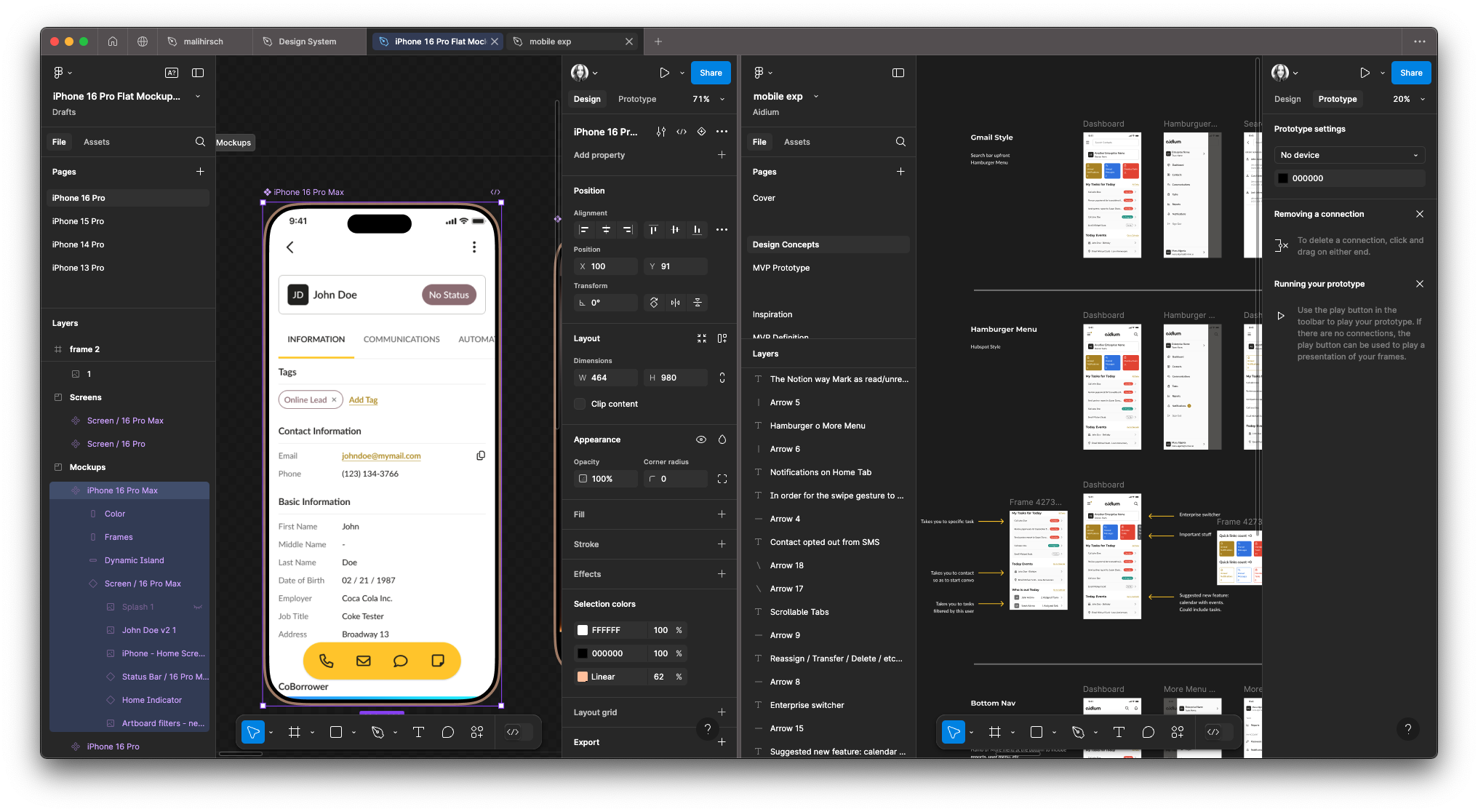
As a designer, sometimes it is essential to remember to play. For this problem I put the options in Figma and visualize how the navigation could work. I tried three different variations: Gmail style, Hamburger, and lastly, the bottom navigation pattern.
Proposed Solution(s)
I created three prototypes, each one featuring a different way to access the navigation. The interaction was slightly different, and I wanted to measure which one served the users best.
I facilitated unmoderated user testing with the customers. The version that was most positively reviewed was the bottom navigation. The main advantage was that it got out of the way. It didn’t fill extra space like a top nav would, and that was important to our users.
How did the proposed solution solve the problem?
User testing of three types of mobile navigation designs revealed distinct usability patterns among participants. The Google style navigation, while familiar, caused confusion due to overlapping options, leading some users to overlook key features. The Hamburger navigation was visually appealing but often resulted in slower access to essential functions as users needed help to locate hidden menus. However, the bottom navigation emerged as the clear winner, providing a streamlined experience and allowing quick and intuitive access to core functionalities. Participants appreciated its accessibility and ease of use, resulting in higher engagement and satisfaction levels, which solidified its position as the preferred design choice.


